- Daily Success Snacks
- Posts
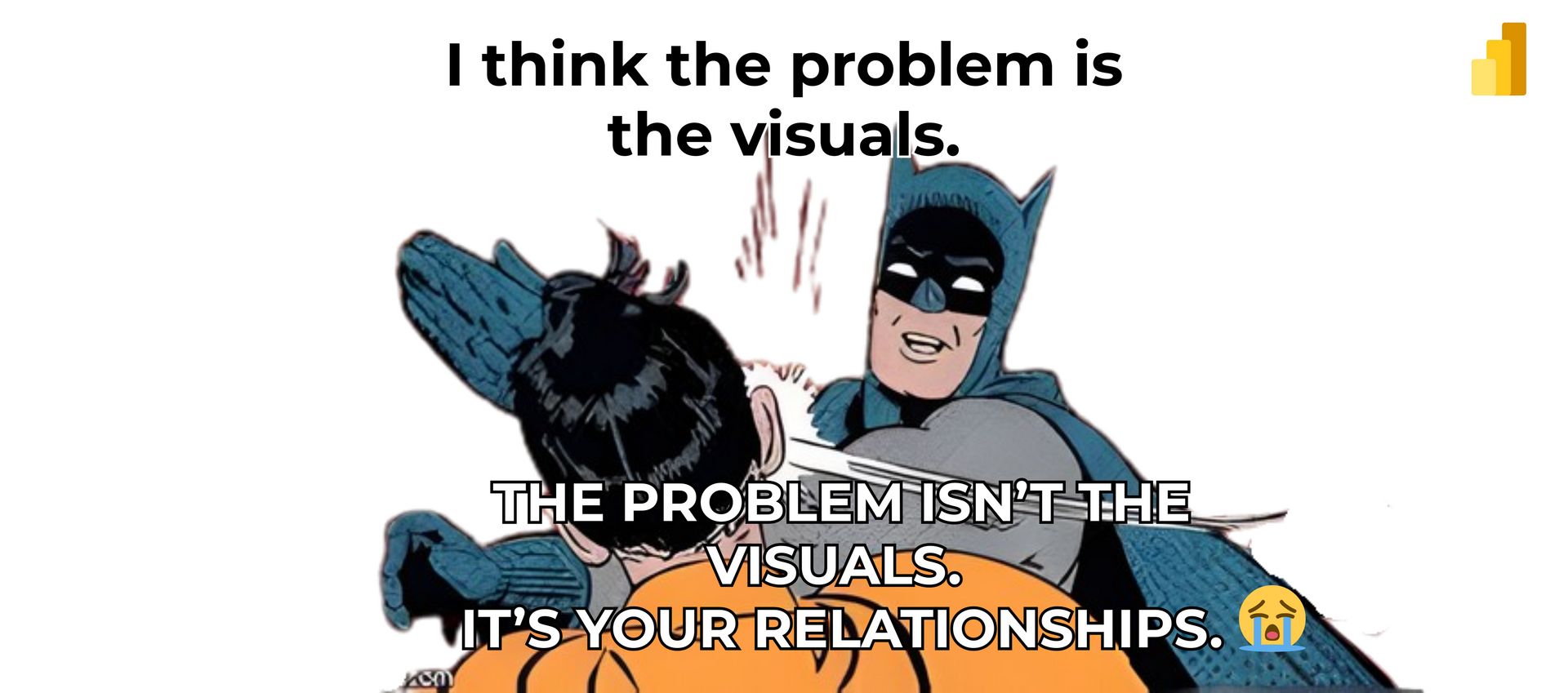
- Your Dashboard Isn’t Failing Because of the Visuals (It’s Something Much Worse)!!
Your Dashboard Isn’t Failing Because of the Visuals (It’s Something Much Worse)!!
You don’t fix dashboards by swapping charts. You fix them by fixing relationships.
Glenda Carnate
November 21, 2025
Read time: 2.5 minutes
If you’ve ever stared at a messy dashboard and thought, “Maybe I just need a better chart,” this is the pivot that will instantly make you a stronger analyst.
A colleague recently spent two hours redesigning a dashboard because “the visuals just aren’t speaking to people.”
After the fifth revision, the problem was still there. Charts had changed. Colors had changed. Nothing improved.
Why? Because the issue wasn’t the visuals... it was the relationships underneath them.
THE REAL FIX: STOP REARRANGING CHARTS. FIX YOUR DATA MODEL!
1. Treat relationships like brains, not plumbing.
The effectiveness of your visuals depends on the quality of the underlying data connections.
Weak data relationships result in limited insights. Strong data relationships enable dashboards to deliver meaningful analysis.
2. Implement a clear and consistent star schema.
Include a fact table.
Add dimension tables.
Ensure keys are clean and consistent.
This structure resolves over 80% of business intelligence confusion.
3. Build data relationships intentionally, not automatically.
Auto-detect is convenient… but convenience is exactly where dashboards go to die. Create relationships on purpose, not by default.
4. Make your data model explainable in one sentence.
If you can’t explain how your tables relate without needing a whiteboard, your visuals will never make sense either.
💡Key Takeaway:
Dashboards become impactful when the data model underneath is clean, logical, and connected with purpose. Clarity in your relationships creates clarity in your visuals, not the other way around.
👉 LIKE if this reshaped how you think about dashboards and BI design.
👉 SUBSCRIBE now for daily data insights that make your dashboards sharper, faster, and genuinely useful.
👉 Follow Glenda Carnate for practical breakdowns that help analysts, developers, and leaders build better reporting—without guesswork.
Instagram: @glendacarnate
LinkedIn: Glenda Carnate on LinkedIn
X (Twitter): @glendacarnate
👉 COMMENT the dashboard mistake you see most often; your example might be the next one I unpack.
👉 SHARE this with someone who keeps changing visuals when the real issue is staring them right in the data model.
Reply