- Daily Success Snacks
- Posts
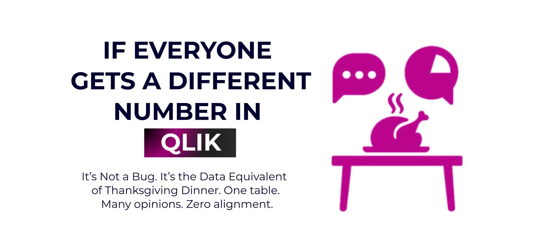
- If Your Qlik Dashboard Shows Different Numbers, It’s Not a Bug—It’s Thanksgiving at the Table!
If Your Qlik Dashboard Shows Different Numbers, It’s Not a Bug—It’s Thanksgiving at the Table!
One table, many opinions, and no alignment.
Glenda Carnate
November 27, 2025
Read time: 2.5 minutes
Everyone opens the Qlik dashboard hoping for clarity but finds disagreement instead. With different numbers and interpretations, even a simple KPI can turn into a family debate about who made the best stuffing.
Sales shows one number, Finance shows another, and Ops has a third. Qlik isn’t broken. It just reflects the reality your team already faces. Each department uses different definitions, date ranges, and selections, and they all make sense in their own way. The dashboard doesn’t cause confusion; it simply makes misalignment clear.
Qlik doesn’t make decisions, but it brings them to light. With multiple apps, separate models, and different calculations, it acts like a mirror that shows where your team isn’t aligned. To get one number, one truth, and one definition, someone needs to take ownership of the metric. Otherwise, your data is just another family argument shown in color-coded charts.
5 Hard Truths Qlik Reveals About Your Data:
1. Different Numbers Are About Context, Not Error.
Your dashboard shows differences in date fields, data levels, states, and selections. These discrepancies were there before you even opened the app.
2. Clarity Comes From Misalignment, Not From Confusion.
Green, white, and gray don’t lie. Qlik shows your choices and exclusions, so teams can see exactly where their interpretations are different.
3. Everyone Can Be “Right” in Their Own Logic.
Set analysis lets users adjust KPIs in a mathematically correct way, but without clear rules, this leads to a fragmented truth.
4. Multiple Models Give Multiple Realities.
Independent apps and QVD chains create parallel truths. Moving fast without shared definitions just means moving fast without alignment.
5. Real Consistency Requires Ownership.
Governance features such as master items, validated transformations, and standard scripts only work when a single team is in charge. Tools don’t unify metrics, but leadership does.
💡Key Takeaway:
Qlik isn’t the problem. The real issues are your definitions, models, and ownership. Harmony happens when someone leads, defines the metric, and enforces a single source of truth. One definition, one number, one owner. Otherwise, your dashboard is just a mix of opinions.
👉 LIKE this post if it feels familiar.
👉 SUBSCRIBE now for more insights that help you cut through data chaos.
👉 Follow Glenda Carnate to turn complex dashboards into clear, actionable insights.
Instagram: @glendacarnate
LinkedIn: Glenda Carnate on LinkedIn
X (Twitter): @glendacarnate
👉 COMMENT your most chaotic dashboard story in the comments. Let’s normalize the struggle.
👉 SHARE this to save a KPI or maybe even a Thanksgiving, today!
Reply