- Daily Success Snacks
- Posts
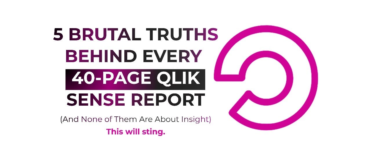
- 5 Brutal Truths Behind Every 40-Page Qlik Sense Report (And None of Them Are About Insight)
5 Brutal Truths Behind Every 40-Page Qlik Sense Report (And None of Them Are About Insight)
When a report reaches 40 pages, the challenge is not seeking insight but addressing the underlying issues it conceals.
Glenda Carnate
December 04, 2025
Read time: 2.5 minutes
A 40-page Qlik report rarely prioritizes clarity. Instead, it often reflects organizational caution and apprehension through excessive visualizations.
A BI team recently presented a carefully designed 40-page Qlik Sense report. Despite its clean layout and consistent color scheme, it did not receive the expected positive response. Organizational leaders reviewed the report in silence, searching for actionable insights. As they continued, their frustration became evident.
By the 10th page, it was very clear that the report was not designed to drive action. Instead, it aimed to address concerns about possible omissions. Each additional sheet acted as a safeguard, reflecting uncertainty in the data model, data lineage, or governance. The report functioned more as a security measure than an analytical tool.
Research on analytics adoption shows leaders are nearly twice as likely to delay decisions when faced with excessive, unnecessary data views. More reporting often results in hesitation rather than clarity.
5 Truths Every 40-Page Qlik Sense Report Quietly Reveals:
1. Leadership Lacks Complete Trust in the Data Model
When a report reaches 40 pages, the motivation is rarely curiosity. It is often driven by doubt, especially about data lineage.
There is doubt concerning data governance.
There is skepticism about the reliability of the so-called 'single source of truth.'
Qlik’s associative model can quickly reveal data gaps, yet organizational leaders may not trust the insights it provides.
2. Lengthy Reports Denote Apprehension Toward Decision-Making Rather Than Providing Decision Support
Qlik is designed to facilitate immediate data exploration.
🟢Green = selected
⚪White = possible
🔘Gray = excluded
Requests for 40-page reports often aim to create a buffer rather than deliver proper insight. This approach provides reassurance while appearing thorough.
3. Genuine Insights Can Be Presented on a Single Qlik Sheet; Additional Content Often Constitutes Noise
Meaningful insights are simple: one KPI, one trend, one interaction, one decision. When reports span many sheets, it often signals a lack of alignment on key priorities.
4. Complexity Does Not Indicate Sophistication; It Often Reflects Unresolved Issues
Synthetic keys, circular loops, lengthy scripts, and unused fields do not indicate advanced analytics. These features often reflect technical debt masked by visuals. Qlik promotes clarity and readily exposes analytical shortcuts.
5. If a Single Sheet Cannot Support Decision-Making, the Data Model Lacks a Coherent Narrative
Qlik is engineered to reveal connections instantly.
If leaders must review 40 pages to understand the impact, the issue lies with the data model, logic, or willingness to act on the insights, not with the dashboard itself.
💡Key Takeaway:
Qlik is intended not to provide reassurance but to challenge users with the realities revealed by the data.
Insight is inherently straightforward. Avoidance often appears as unnecessarily lengthy reports.
👉 LIKE if this finally puts words to something you’ve seen in your own BI projects.
👉 SUBSCRIBE now for more honest, sharp takes on analytics, dashboards, and decision-making.
👉 Follow Glenda Carnate for daily breakdowns that simplify BI rather than overwhelm it.
Instagram: @glendacarnate
LinkedIn: Glenda Carnate on LinkedIn
X (Twitter): @glendacarnate
👉 COMMENT with the longest report you’ve ever been asked to build — or explain.
👉 SHARE this with someone who still believes “more pages = more insight.”
Reply